
Organization and Presentation
Structuring Content for Better User Experiences
Visitors interact with website content in different ways. Some quickly scan pages for key information, others read until they find what they need, and a smaller number take the time to read every word. Regardless of how someone consumes your content, it should be organized and presented in a way that makes important information easy to find and encourages visitors to stay engaged.
In this section, you’ll learn how to improve your content’s organization and structure to create a clearer, more effective experience for every visitor.
Working in WordPress: Let’s Get Organized!
Organizing content on your website involves structuring information into a logical hierarchy, including clear and scannable sections for different messages, and considering your audience’s needs to ensure easy navigation and quick access to relevant content.
Organization Drives Content Success
One of the defining characteristics of an effective website is how its content is organized. Before considering how content should look on the page, it’s important to determine how it will be structured. A thoughtful content hierarchy helps ensure that key information appears where users are most likely to notice it, creating a page that feels intuitive, welcoming, and engaging.
It’s also important to recognize that not every page on your website serves the same purpose. Some pages are designed to encourage users to engage with your content and take a specific action, such as registering for an event, submitting a form, or exploring additional resources. These high-impact pages should be structured to guide users naturally toward those goals.
Other pages, such as an About page, serve a more informational purpose. Rather than driving a specific conversion, they provide context about your department, answer common questions, and help users navigate to other areas of your website. Understanding the purpose of each page allows you to organize content in ways that best support your users’ needs and create a more effective overall website experience.
Strategies for More Effective Content
While there is no definitive playbook on how to organize website content, here are four proposed steps that you should consider taking before updating or publishing your content.
Step 1: Collect all your content
Before you can determine how to organize your content, you first need to identify what content will appear on the page. Gathering all of the relevant text, images, videos, and other assets upfront gives you a complete picture of what you’re working with. From there, you can begin organizing the content into a logical structure that flows naturally, highlights the most important information, and encourages users to engage with the page.
Step 2: Identify its purpose
How you expect users to engage with your content should guide you on how to organize it. This will allow them to complete a task or goal with greater ease and increase the likeliness of them returning to that page or your site.
- Inform or Create Awareness: These pages provide the user with information and simple tasks that keep them moving through your site to pages where they can perform an action.
- Take Action: These pages are focused on convincing the user to do something, like submit a form or register for an event. Action-focused content, such as buttons or forms, should be clear, scannable, and easy to find.
Step 3: Prioritize
This is when you should be thinking about what your users are looking for. Once your content is organized, make sure to plan for any information that your users are coming to your site/page to be placed at the top where it can easily be seen. Information that you feel is important for your users to know about should immediately follow that.
While not all users look for information the same way and in the same places, consider using this guide to help decide where information should be placed on your homepage or another page on your site.
Step 4: Begin building your page in WordPress
Within the UMC WordPress theme there are many blocks you have access to in order to organize your content. However, there is one block in particular that you should use as the foundation for placing your content: Columns.
Columns allow you to organize content into distinct sections and rows across your page. This makes it easier to group related topics and messaging together, creating a clear visual hierarchy and helping each section feel cohesive, organized, and connected around a common theme.
Using columns effectively
There is no rule for how you can use columns, how many you should use in a row, or where to place them since your content drives how you present information on your page. However, let’s explore a few examples that should give you a better idea of what to think about.
Single Column
Best used with: Regular width option (or None)
We recommend using single-column layouts for written content and avoiding overly wide or full-width text blocks. Also try to avoid adding images that float to the left or right of your copy in a single column. Narrower text columns make content easier to read and help visitors focus on your messaging without competing visual elements or excessive line lengths.
60/40, 40/60, and 50/50 Columns
Best used with: Wide width option
60/40, 40/60, and 50/50 columns work well when you want to pair written content with supporting information or visual elements. For example, you can place your primary content in one column and an image or other visual in the adjacent column.
We recommend using the wide width for most of these layouts. This provides enough space for both columns to breathe, creating a more balanced and comfortable experience for visitors.
Reminder: Content in the right column will stack beneath the content in the left column on smaller screens. Place your most important content in the left column so visitors encounter your primary messaging before any supporting content.

33/33/33 Columns
Best used with: Wide width option
The 33/33/33 column layout is a great way to organize related content—especially overview content—into distinct subtopics within the same section. This layout helps visitors quickly scan and understand the different areas of information.
The Demon Deacon
Use a heading to help visitors identify what the content is. Also try using different background styles to make each of the three columns stand out while still feeling connected. This column is using the grey background style.

Consider using images to draw attention to important content and reinforce your messaging. Whenever possible, choose images that are directly relevant to the content they accompany and add meaningful context or visual interest.
Create a Homepage Users Want to Use
The content you choose to feature on your homepage may differ from another department’s because every audience has unique needs. Regardless of the specific content, however, your homepage should always be designed with your user’s needs in mind. While the content on every homepage may serve a different purpose, the way we organize it should follow a consistent, user-centered approach across all Wake Forest websites.
The banking example
Consider this scenario. You’re looking to open a new savings account. Although you already bank elsewhere, you’re interested in switching to take advantage of better rates and incentives. After a quick Google search, you click on a link that takes you to a bank’s homepage that you’re interested in learning more about. Before you even arrive, you already have a clear idea of what you’re hoping to find.
- What products and services do they offer?
- What interest rates can I expect?
- How easy is it to open an account?
- Can I trust this bank with my money?
These are the questions you expect the homepage to answer immediately—or at the very least, make it easy to find the answers. If that information isn’t readily available within the first few seconds, you have to stop and figure out where to look next. Every additional moment spent searching increases the mental effort required to use the site. If the experience isn’t intuitive, frustration grows, and you may abandon the website altogether in favor of another bank that makes finding information easier.
The same principle applies to our websites. Visitors arrive with specific goals and expectations. A well-organized homepage anticipates those needs, surfaces the most important information, and helps users quickly find what they’re looking for, creating a more effective and satisfying experience.
Prioritizing homepage content
How you organize your homepage content can have a significant impact on user experience. Consider using the following structure:
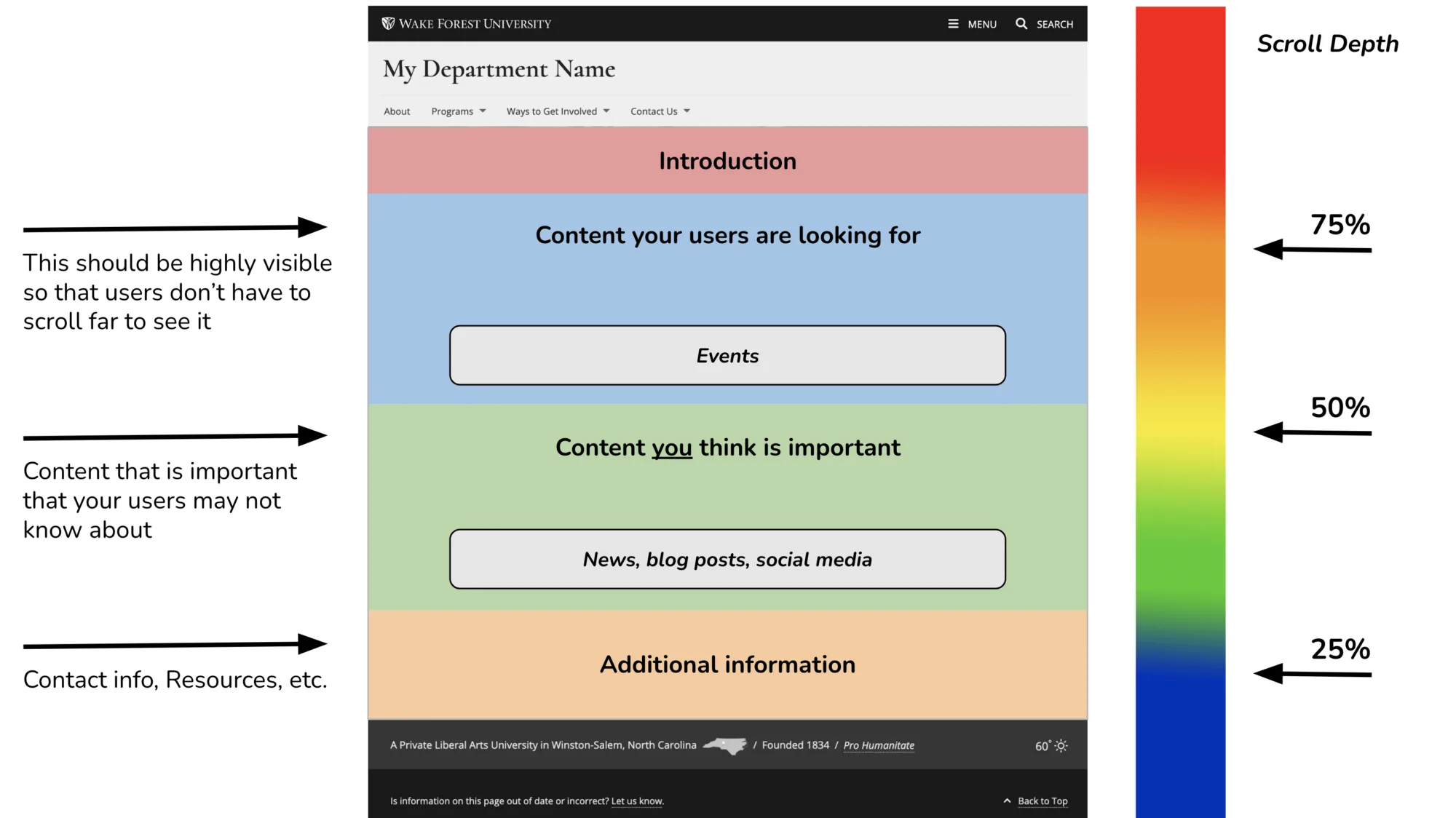
Organizing your content this way ensures that the information users are actively looking for appears first, allowing them to accomplish their primary goal quickly and easily. Once you’ve met that immediate need, you can introduce additional content that is important for your department to communicate. While it may not be the reason visitors came to your website, it is often information they will find valuable.
By placing this secondary content immediately after the information users came to find, you increase the likelihood that they will continue scrolling and discover it. When users have a positive experience finding what they need, they are much more likely to stay engaged with the page and explore the additional content you’ve thoughtfully placed along the way.
Keep in mind that users typically spend less than 10 seconds on a homepage, so capturing their attention quickly is essential. Make sure your homepage features the right content to immediately communicate value and encourage visitors to continue exploring your site.
Commonly Asked Questions
What overall purpose should my homepage serve?
Your homepage should serve as a central hub that helps users quickly understand who you are, what you offer, and where they should go next. Rather than trying to tell your entire story, think of your homepage as a collection of concise, engaging previews that introduce your department’s key information, highlight important resources, and guide users to the content they’re looking for. It should balance what your users need to know with what you want them to discover.
How should I think about organizing the content for a specific topic on my homepage?
Consider using this guide to help you create noticeable and user-friendly content on your homepage:
- Image or other visual element. A visual element is a great way to get the user’s attention as they’re looking at your page.
- Clear and concise heading. Create a heading that clearly states what this content section is about. For users looking for that specific content, this will provide reassurance that they are in the right place.
- Description. Provide a few short sentences of context to support the heading for this section. This will help your users feel assured that they’re in the right place.
- Call-to-Action. Make sure you have a button or other link that takes the user to another page where they can learn more or complete a task.
Refer to the following content section on the WFU Undergraduate Admissions homepage that demonstrates how these four elements come together.

Are image sliders a good way to visually represent what my department does?
Image sliders should be avoided whenever possible. There are several reasons for this:
- When users arrive on a homepage, they often decide within just a few seconds where to go next. Because of this, image sliders rarely receive the attention they’re intended to attract. Even sliders with only a few slides often take longer to cycle through than users are willing to wait, meaning much of the content they contain is never seen.
- Most visitors don’t come to your website to watch a rotating banner—they come to find information, answer a question, or complete a task. Content that is essential to your message or goals shouldn’t depend on users waiting for the next slide to appear.
- Although the Image Slider block available in our WordPress environment is accessible, the experience isn’t always as effective on smaller screens as it is on desktop devices. Important content can become less prominent, and navigating between slides may require additional effort on mobile devices.
For these reasons, many organizations have moved away from image sliders in favor of static hero sections that feature a single, focused message and clear call to action. If you want to create a more dynamic first impression, consider using a short-form video or subtle motion graphics that reinforce your primary message without competing with it.
How to Make an Awesome Homepage
In this presentation, we’ll address some key information that web content managers should be including on their homepage, ways to get visitors to engage with that content, and how to leverage various WordPress blocks to make it happen.
Does My Homepage Still Matter?
Today, AI-powered search experiences are changing how people access information, with many users arriving on internal pages—or finding answers without visiting a website at all.
So, is the homepage still relevant? The answer is yes—but its role is evolving. The question is no longer whether you need a homepage, but how to make it valuable for the users who still depend on it.
Content Presentation
Once you’ve determined how your content should be organized, the next step is deciding how it should be presented. The way your content is presented has a significant impact on how users perceive both your website and your department. A well-designed experience can build trust and encourage engagement, while a poor experience may cause visitors to leave before finding the information they need.
When evaluating your website’s content presentation, focus on these key areas:
While it’s important to ensure each of these elements is visually appealing and functions effectively, it’s equally important to consider how they work together to create a cohesive user experience. When thoughtfully designed, these components guide visitors through your site, help them find information more easily, and keep them engaged.
How to Optimize Your Web Content
In this presentation, we’ll discuss different ways to present your site navigation, page content, and site footer in order to foster a better overall user experience and encourages visitors to engage with the content on the site.
Effective website navigation acts as a roadmap, helping users find the information they need quickly and intuitively. By making it easy to explore your site, clear navigation encourages visitors to stay longer, discover additional content, and engage more deeply with everything your website and department has to offer.
Users don’t always enter your website through the homepage. In fact, with the growing use of generative AI tools such as ChatGPT and Google AI Overviews, many visitors now arrive directly on internal pages through links included in AI-generated responses and citations. Once they’re on your site, your navigation should make it easy for them to explore related content and find what they need—without requiring them to return to the homepage to get their bearings.
Here are some things to consider when evaluating your site navigation:
- Several users rely on navigational links to get around upon their first visit to a site.
- Navigation labels should be short and easy to read.
- Try to limit how many links you provide; group related content together under one umbrella term.
- Make sure your pages are nested properly (breadcrumbs).
Nesting pages and breadcrumbs
Make sure your pages are nested in the correct sections of your site based on your information architecture (in other words, how you have your pages organized). Unless it’s intentional, do not publish them at the root level of your site and then add them in your nav.
Here we see the Campus Visit and Tours page appear under the Explore and Visit section in the site nav. This does not mean it was nested under the Explore and Visit parent page in the WordPress editor.
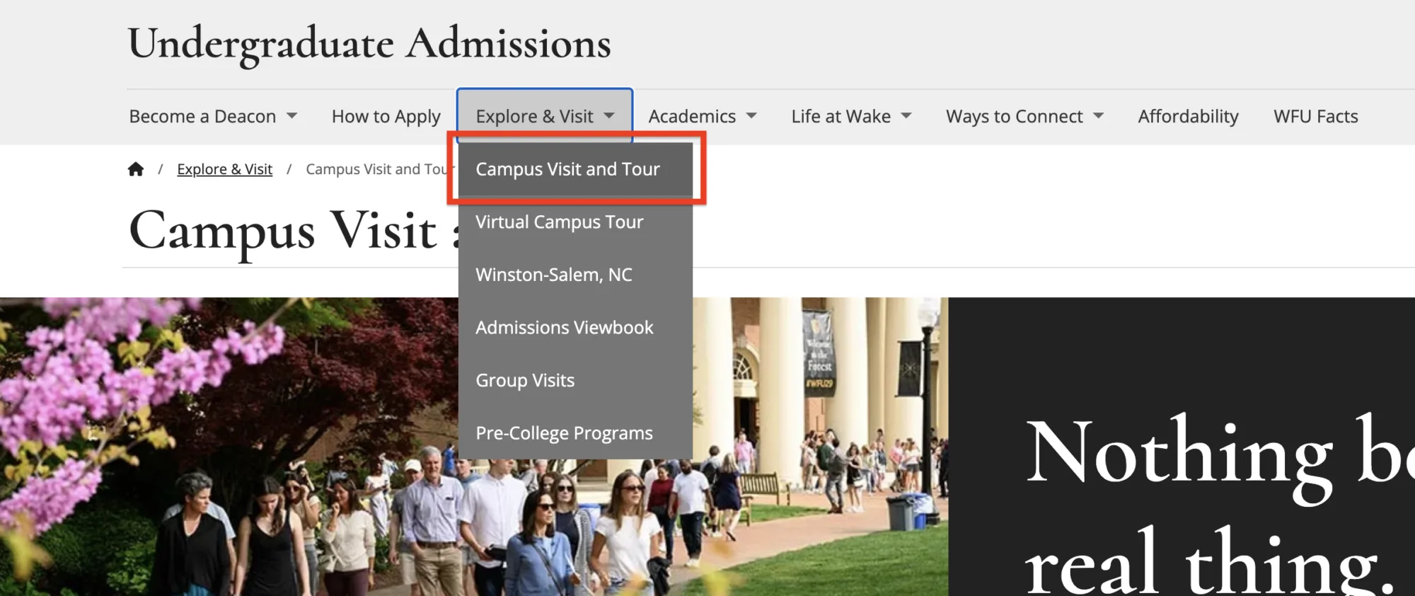
Before publishing, make sure to nest (save) the page under the appropriate section. Check the page’s breadcrumbs to verify it’s in the correct place.
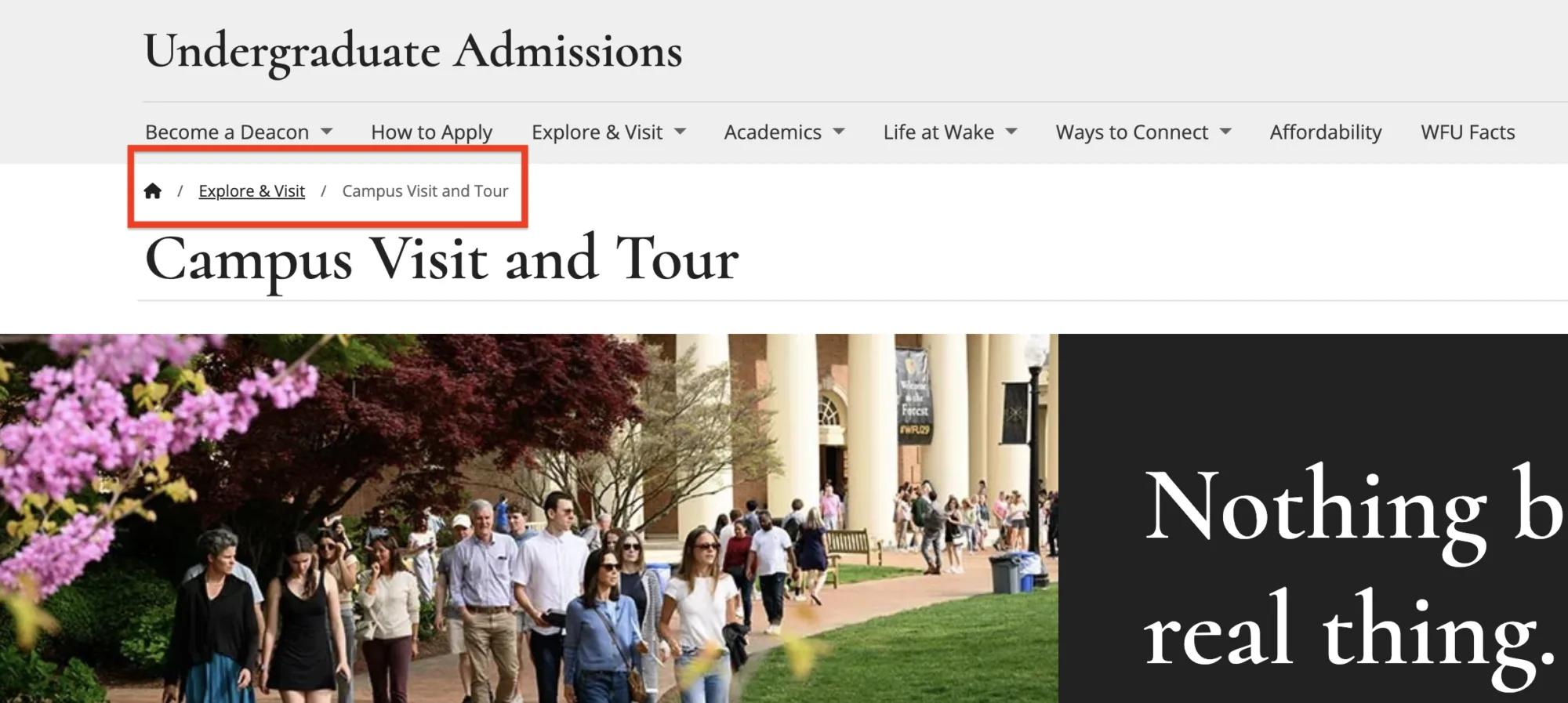
You can learn more about how to nest pages on your site by visiting the Organize Your Pages section on the WFU WordPress Guide website.
Page Content
As outlined in the Content Strategy page, there are two primary types of web pages that shape the user experience: pages designed to educate and inform, and pages that encourage users to complete a specific task or goal.
To Educate or Inform
- When you want someone to learn more about a product or service you offer
- Content that keeps users moving through your site
To Take Action
- Content you want users to interact with
- May be the last page on your site the user engages with (completes a goal)
Pages designed to educate or inform are typically intended to help users gather information. Rather than asking visitors to complete a specific task, these pages should present content in a clear, organized way while providing intuitive navigation that encourages users to continue exploring your website.
In contrast, pages intended to drive user action should include clear calls to action and straightforward instructions for completing a task. Visitors who arrive on these pages are often ready to move beyond the information-gathering stage and engage with your department—whether that’s submitting a form, registering for an event, or completing another meaningful action.
Overcome the trap of perfectionism.
It’s easy to become fixated on perfecting every detail of a webpage—adjusting spacing by a few pixels, resizing images, or rewriting the same sentence over and over until it feels just right. While these refinements can improve the overall presentation, they rarely have as much impact as accurate, relevant, and up-to-date content.
Most users won’t notice minor visual adjustments unless they negatively affect the experience, such as making a page difficult to use on a mobile device or obscuring important information. They will, however, notice when information is outdated, inaccurate, or difficult to find.
Strive for a polished experience, but don’t let the pursuit of perfection delay publishing valuable content or keeping existing content current. A page with accurate, trustworthy information will almost always provide more value to users than one with flawless visual alignment.
Optimize your page content.
Creating valuable content starts with understanding your users’ needs. The following best practices can help ensure your content is optimized to deliver the information they’re looking for in a clear and effective way.
- Make sure to describe what the purpose of the page is up-front and provide content that your users are looking for.
- Your most important messaging should be visible without making them scroll (too much).
- Use clear, specific, and familiar wording for link and button labels.
- Lesser important content should always follow your primary messaging.
- For longer scrolling pages, consider adding multiple call-to-actions for important content in both the relevant section(s), at the bottom of the page, and/or on the right-hand side.
- Include callouts or designated areas for related content.
Do a quick (5 minute) page audit.
Sometimes, taking a step back to evaluate the content on your page is the best way to determine what needs to be changed, removed, or added. That’s where the 5-Minute Page Check can help. Use this rubric to quickly assess how well your page is performing across key areas, including readability, accessibility, calls to action, and more.
Commonly Asked Questions
Are long scrolling pages still discouraged?
For many years, industry experts encouraged content creators to avoid placing too much information on a single page. The thinking was that users were unlikely to scroll through long pages, and excessive content could negatively affect page performance, especially on mobile devices or slower internet connections.
Today, that thinking has evolved. Improvements in web performance, changing user behavior, and the growing influence of AI-powered search experiences have made well-structured, long-form content more valuable than it once was. Search engines and AI tools such as ChatGPT and Google AI Overviews can better understand comprehensive content when related information is grouped together in a single, authoritative resource rather than scattered across multiple pages. Likewise, users often prefer finding everything they need in one place instead of navigating through several pages to answer a question or complete a task.
That doesn’t mean every page should become a lengthy guide. The goal is to create pages that are comprehensive, but still scannable, without becoming overwhelming. Organize content into logical sections with clear headings, concise paragraphs, and meaningful navigation so users can quickly find the information that matters most to them.
If a section of content begins to grow into a substantial topic of its own, consider moving it to a dedicated page where you can explore the subject in greater depth. Then, link the pages together in a way that feels natural and intuitive, allowing users to move seamlessly between related topics while maintaining a clear sense of how the information fits within the broader theme of your website.
Should I try to avoid using WordPress blocks that hide my content when a page is loaded?
The best approach depends on the purpose of your content, how users are expected to interact with it, and the overall goals of the page.
As a general rule, avoid placing essential content behind accordions or other expandable elements if that content is necessary to communicate the page’s primary message or help users complete a task. While accordions can reduce visual clutter and make a page easier to scan, they shouldn’t be used simply to hide important information. Keeping key content visible allows users to find what they need more quickly and makes the page’s primary message immediately clear.
Accordions are best reserved for supporting content—information that provides additional context, answers secondary questions, or expands on a topic without being essential to understanding the page. This approach allows users who want more detail to explore it without interrupting the experience for those who are focused on completing a task or finding a specific piece of information.
The goal is to prioritize your content. If information is critical to the user’s journey, make it visible. If it adds value without being essential, consider placing it in an accordion or another expandable component to keep the page organized while still making the content easily accessible.
When should I use images on a page?
Images can enhance your content by reinforcing key messages, illustrating concepts, and creating visual interest—but they should always serve a purpose. Overusing images can distract users from the content they’re trying to read, create unnecessary visual clutter, and negatively impact page performance, particularly for visitors on slower internet connections or mobile devices.
Use the following guidelines to determine when imagery adds value to a page:
Featured images
Featured images appear at the top of a page and help establish the overall tone or theme. They are most effective on landing or overview pages—such as those linked from your primary site navigation—or on pages with a stronger marketing or storytelling focus.
Inset images
Inset images are positioned alongside page content and should be used only when they directly support the accompanying text. Their purpose is to help users better understand the content by providing a relevant visual example or reinforcing the message being presented. To maintain a balanced layout and keep the focus on the written content, inset images should generally occupy no more than one-third of the available row width.
When using multiple images on a page, be intentional. Every image should have a clear purpose and contribute to the user’s understanding of the content. If an image doesn’t add meaning or context, consider leaving it out. Well-chosen imagery complements your content, while excessive imagery can compete with it for the user’s attention.
Is it OK to have more than one call-to-action on a page?
Yes—but use them strategically. Including multiple calls to action on a page is fine, as long as they don’t compete with one another for attention. When too many actions appear equally important, users may hesitate or become unsure about what to do next.
Every page should have one primary call-to-action that clearly stands out and aligns with the page’s main purpose. Supporting or secondary actions can still be included, but they should be presented with less visual emphasis so they don’t distract from the primary goal.
To draw attention to your primary call to action, consider using a button or another prominent visual treatment. While text links are effective for navigation and supporting actions, they typically don’t provide enough visual emphasis to guide users toward the page’s most important action.
Site footers—the section that appears at the bottom of every page on your website—play an important role in helping users quickly find key information about your department. Visitors have come to expect details such as contact information, office hours, social media links, and other commonly accessed resources in the footer. Because this placement has become a widely recognized web convention, including this information in your footer makes it easier for users to find what they need without having to search your site.
Here’s what to keep in mind:
- Focus on your contact info – that’s what users primarily look to your footer for.
- Don’t include lengthy copy because it’s unlikely to be read (e.g., your ‘about us’ statement).
- If you have different pages where someone can connect with you or receive additional information, like social media links, provide those details here.
Your Digital Strategy Toolbox

Content
A well-defined web content strategy drives user experience, content visibility, and overall website performance.

Analytics
Analytics help you uncover insights, identify trends, and guide improvements for your website content strategy.

GenAI & SEO
How people discover information has changed—and continues to evolve. Here’s why that matters and how to approach it.

Accessibility
An effective website is designed not only for its intended audience, but to ensure everyone can access its content.
Online Presentations
Whether you’re interested in attending an upcoming digital strategy presentation or want to revisit a previous one, explore the topics we cover and resources we share.
Glossary of Terms
Digital strategy involves a lot of terminology that can feel overwhelming. We’re here to help clarify some of the most common terms and concepts you’ll encounter.
Want to Chat?
We’re here to support your digital strategy efforts. Reach out with questions or schedule a consultation with us to discuss your website strategy.