
Writing for the Web
Write for Visibility and Value
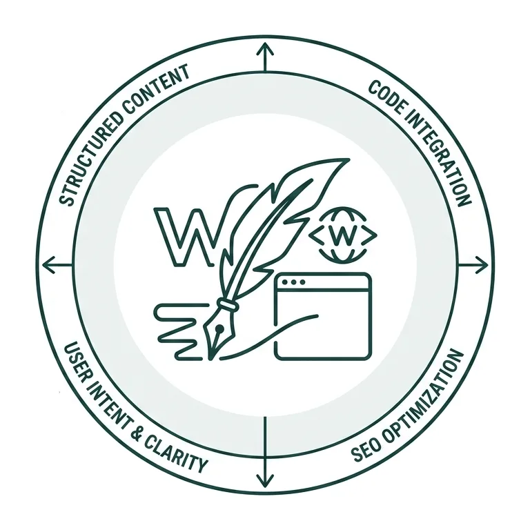
How you write your content influences nearly everything that happens afterward—from how search engines and AI-powered tools discover and interpret it to how visitors engage with it. More importantly, it shapes how people perceive your department, understand what you offer, and decide whether your content is worth their time and attention.
As we work to improve our visibility in search and AI-powered experiences, it’s easy to focus on technology and optimization tactics. But effective content visibility begins with something much simpler: how you write.
Writing for the Web
Finding the right messaging strategy for your website can be challenging. We need to ask ourselves questions like “What are the best practices for writing effective web content?” and “How do we balance the needs of users who want quick answers with those seeking more detailed information?“.
While there is no one-size-fits-all approach, following established guidelines can help create a cohesive, brand-aligned web presence.
Know Your Audience
One of the defining characteristics of an effective website is how its content is organized. Before considering how content should look on the page, it’s important to determine how it will be structured. A thoughtful content hierarchy helps ensure that key information appears where users are most likely to notice it, creating a page that feels intuitive, welcoming, and engaging.
What’s in it for me?
This is a question you should answer early in your communications and marketing copy. Visitors may not consciously expect your content to be tailored to their specific needs, but they are almost always asking themselves one simple question: “What’s in it for me?”
Your messaging should make that answer clear from the start by demonstrating how your content addresses their goals, solves their problems, and/or provides value. They’ll stay engaged with your content if they feel there’s something in it for them that they find value in. Whether that’s the tone you use to make them feel more emotionally connected to what services your department offers or a clear path for them to complete a task that brought them here, make sure your messaging speaks to them.
Remember that they are always the “me” on your website.
A word of caution: avoid trying to write for every audience at once. Doing so often dilutes your message, making it less effective for everyone.
Instead, focus your content on your primary audience—the people most likely to visit your site. If your website serves multiple audiences, maintain a tone and voice that feels welcoming and relevant to all users, even when the content is written with a specific audience in mind. This allows your messaging to stay focused without making other visitors feel the content isn’t meant for them.
Write for Different Users
The way we talk about our departmental services should align with Wake Forest’s established brand guidelines to ensure the university communicates with a consistent, unified voice. That consistency, however, doesn’t mean every website or department must sound exactly the same.
Adapt your tone and messaging to the needs and expectations of your audience while remaining true to the Wake Forest brand. The goal is to create content that feels authentic, resonates with your users, and encourages them to want to explore your site and become an engaged user.
You also need to consider the type of user who is visiting your site. How motivated are they? How willing are they to engage with your content? Are they here to find an answer to a question or would they rather grab a cup of coffee and spend thirty minutes learning everything they can about a specific topic?
Below you’ll see different user personas that you should become familiar with, and we’ll review the differences between each one in the next section.
User personas
Visitors come to our website for many different reasons and bring with them a wide variety of backgrounds, experiences, and expectations. The four most common types of users are identified as:
Let’s also consider one more type of user—the one who uses AI tools to gather information without ever visiting your site:
The Looker
Average time on a site: 30 seconds
Lookers are typically in the earliest stages of gathering information. They arrive with a specific goal and want to find what they need as quickly as possible—whether that’s an email address, a phone number, an event date, or another key piece of information.
In some cases, they’re looking for an answer to a broader question that provides just enough information to help them decide whether they want to continue exploring your website or engage further with you.
Example: Is Wake Forest a good school?
The Scanner
Average time on a site: 3 minutes
Scanners are not reading all of your content. Instead, they’re skimming and scanning for key ideas. They will dive a little deeper into your content and are willing to spend a little more time checking out a few more pages to learn about you or something that interests them.
- Example: Does Wake Forest have the major I’m interested in? What campus life programs do they offer?
The Reader
Average time on a site: 30 minutes
Readers are visitors who want to engage more deeply with your content and learn more about what you have to offer. They are actively seeking information, are likely to explore multiple pages across your website or the Wake Forest website, and are investing more time in understanding your programs, services, or opportunities.
Because of this deeper level of engagement, Readers are more likely to take actions that align with both their goals and your organization’s objectives—moving them further along the journey from initial awareness to meaningful engagement or conversion.
Example: I’m narrowing down my choices and want to make sure I have all the information I need before I apply for admission.
Readers are the audience we want to reach because they invest time exploring our content, demonstrating a higher level of engagement and an increased likelihood of continuing their journey with us.
The Researcher
Average time on a site: 3 hours
Researchers are looking for comprehensive, in-depth information. They want to understand the full picture and are interested in the details—the who, what, when, where, why, and how. Unlike users who simply want quick answers, researchers are willing to spend more time exploring your website and don’t mind navigating through multiple pages if it helps them find the information they’re seeking.
Example: These are faculty, graduate students, and prospective employees of Wake Forest.
The Lemming
Average time on a site: 0, nada, nill, zilch
Lemmings, or those who mindlessly follows whatever an LLM spits out (think AI overview at the top of your Google Search results page), may be the most challenging audience to write for because they often never visit your website directly. Instead, they rely on generative AI tools such as ChatGPT, Google AI Overview, and Perplexity to answer their questions. Even so, the information those tools cite or summarize is often drawn from content published on your website.
So, how do you write for this audience? A good approach is to assume they have the same needs as a scanner—they’re looking for clear, concise answers as quickly as possible. Well-structured, well-written content that directly addresses common questions is more likely to be surfaced, cited, and summarized by AI-powered search experiences when users search for relevant topics.
Web Content Readability: It Matters a Great Deal
Readable web content makes it easier for users to understand and engage with your information, improving the user experience, supporting your goals, boosting SEO, and strengthening the Wake Forest brand. But even if you think your content is effective, do you know who can actually read and understand it?
Writing Readable Web Content
One of the most effective ways to improve your website content is to ensure that it’s readable. At first, that may seem obvious—you might be thinking, “Of course my content is readable. Why wouldn’t it be?”
But readability isn’t about whether you can read the content. It’s about whether your audience can quickly find, understand, and use the information you’ve provided. Just as accessibility considers the needs of users with different abilities, readability considers the needs of users with different reading levels, backgrounds, and browsing behaviors.
Effective web content should:
- Be easy to scan so users can quickly find the information they’re looking for
- Be easy to read and understand by a wide range of audiences
Readability + Accessibility
There are certain practices you should always comply with when writing your content to make sure it’s both readable and accessible for all users, regardless of their reading abilities or cognitive disabilities.
Headings
Users with cognitive impairments or low vision benefit from websites that use headings to organize content. Headings allow them to get a sense of the structure and organization of the page. Proper heading structure also benefits screen reader users in that it makes the page easier for them to navigate through.
- Do not select heading levels based on their appearance. Rather, select heading levels based on their appropriate place in the hierarchy.
- Do not create headings by using the bold button.
- Do not overuse headings. Shorter pages likely only need a few Heading 2s <h2> and Heading 3s <h3> for content organization.
Text formatting
Our WordPress environment provides flexibility when it comes to formatting text on your website. However, content editors should be thoughtful when formatting text as they can inadvertently undo the accessibility, visual design, and branding work that are built into our design system.
Following these guidelines will help ensure your content is well-formatted, easy to read, and provides a positive user experience while aligning with our web standards.
Only use text colors that are provided as approved options within each WordPress block. Do not apply custom colors to headings or body text.
Use bold and italics for emphasis only, never for headings. Do not type words in ALL CAPS.
Do not underline single words or phrases as this style is reserved for text links.
Write shorter paragraphs that contain no more than 80 words (or 4-5 lines on a monitor) whenever possible.
Use lists when you need to call out ordered or itemized details.
Consider using multiple columns in a row to call visual attention to multiple topics or ideas (as demonstrated here).
Understanding Reading Levels
People read differently on screens than they do on paper, making clear, straightforward writing especially important. Whenever appropriate, aim to write at the lowest reading level that still accurately communicates your message. Doing so makes your content more accessible to a wider audience, including people with cognitive disabilities, those who speak English as a second language, and users who may be distracted or multitasking while visiting your site.
Flesch Kincaid Grade Level Scoring System
The Flesch-Kincaid Grade Level is a readability metric that estimates the years of formal education required to understand text. Originally developed for the U.S. Navy to assess technical manuals, it helps writers ensure their content is appropriately tailored to their audience.
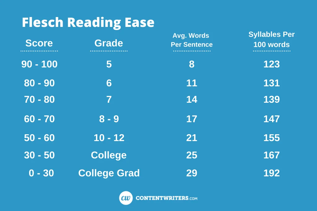
Siteimprove uses the Flesch-Kincaid Grade Level to measure the readability of every published page on your website. As a general best practice, web content should aim for an 8th-grade reading level whenever possible.
At first, that recommendation may seem counterintuitive—especially if you’re writing for prospective students in their final years of high school, current students, or adults. So why is an 8th-grade reading level considered the standard? Let’s take a closer look.
The 8th Grade Reading Level Standard
To understand why an 8th-grade readability level matters, it’s helpful to consider both adult literacy levels and the way people consume information online.
According to recent literacy data, 21% of adults in the United States have low literacy skills, and 54% read below a 6th-grade proficiency level. In addition, many of our international audiences—including prospective students, parents, and families—may not speak English as their first language, making complex or densely written content more difficult to understand.
Even for users with strong reading skills, a lower readability level remains important. People rarely read web pages word for word. Instead, they scan for headings, keywords, and highlighted information to quickly determine whether a page contains what they’re looking for. Long, text-heavy pages can make this process more difficult, increasing the likelihood that users will miss important information or leave the page altogether.
While many users with shorter attention spans may have reading skills above an 8th-grade level, the way they consume online content can create similar challenges.
Writing with readability in mind helps ensure your content is accessible, understandable, and useful to the broadest possible audience. However, readability is not a one-size-fits-all standard. Every page should be evaluated based on its purpose and intended audience. The goal isn’t to simplify every page to the same reading level, but to communicate your message as clearly and effectively as possible for the people you’re trying to reach.
Improving Your Readability Score
When reviewing your website content for readability, consider the following best practices:
- Limit paragraphs to about 80 words (or 4-5 lines on a monitor).
- Use an active voice for clarity. Doing so tends to be more direct and engaging for your audience.
- Define acronyms and abbreviations. The language you include should be able to be understood by everyone.
- Avoid using overly complex language. Also, limit how often you use Wake Forest-specific terminology without providing context. For example, instead of writing “Welcome to The Forest!”, write “Welcome to Wake Forest University—also known as ‘The Forest.'”
- Use visual breaks. Most people scan web pages rather than read them word for word. Using headings, bullet points, and numbered lists helps users quickly locate the information they’re looking for, especially on longer pages.
- Use writing tools like the Hemingway Editor to evaluate readability and improve clarity. If you use AI assistants such as ChatGPT or Google Gemini to help draft and polish content, always review and refine the output to ensure it is accurate, authentic, and aligned with the Wake Forest University brand and voice. AI-generated content should never be published without careful editing and verification.
As a reminder, all staff who are editors or administrators for a UMC-themed Wake Forest website, and all content managers, have the ability to use the Readability module within Siteimprove to monitor and fix issues on their wfu.edu site.
Your Digital Strategy Toolbox

Content
A well-defined web content strategy drives user experience, content visibility, and overall website performance.

Analytics
Analytics help you uncover insights, identify trends, and guide improvements for your website content strategy.

GenAI & SEO
How people discover information has changed—and continues to evolve. Here’s why that matters and how to approach it.

Accessibility
An effective website is designed not only for its intended audience, but to ensure everyone can access its content.
Online Presentations
Whether you’re interested in attending an upcoming digital strategy presentation or want to revisit a previous one, explore the topics we cover and resources we share.
Glossary of Terms
Digital strategy involves a lot of terminology that can feel overwhelming. We’re here to help clarify some of the most common terms and concepts you’ll encounter.
Want to Chat?
We’re here to support your digital strategy efforts. Reach out with questions or schedule a consultation with us to discuss your website strategy.